Looking at rolling camera transitions

Friday, 18 March 2011

Tuesday, 15 March 2011
Hahahaaaa!!!
Today we played around with the cut outs with photos idea.
Here is Ashlea saying "Frolo"... Why? We don't know but it's quite funny.
Monday, 14 March 2011
Walk Cycle Test on Flash
I'm a beginner on Flash so excuse the crapness but today i tried to create a walk cycle BY MY SELF.
Have a look see- my man kinda looks a little ghetto :l
ps: Flash doesnt like to go onto my blog so im sorry for the weird ghost print that happens in the video. I swear that's not actually there...
Have a look see- my man kinda looks a little ghetto :l
ps: Flash doesnt like to go onto my blog so im sorry for the weird ghost print that happens in the video. I swear that's not actually there...
I think this worked out quite well, considering my man has no toes :( and he bobs around a bit as he walks, his knees probably bend too much and he stays too long nearer the ground...
This is the same walk cycle- now with a background. This is to give me an idea of what my chosen style will look like. I think i may play around a bit more with stage colour so that it won't look so plain.
Styles
I'm trying to research some interesting animation styles for the confectionary project... a simple (and obvious) 2-D or 3-D animation wouldn't exactly be the most striking so we thought we'd do some research to try and spark up some inspiration:
I LOVE this style! always have. It's a mix between 3-D and 2-D.. almost like putting 3-D on a 2-D space. The characters have a sort of cut out effect, yet they're able to change their expressions- how do they d this?? it almost seems like magazine or photograph cut outs mixed with flash... it gives the advert an endearing charm- it reminds me of a kid playing around with paper dolls.
This advert reminds me of:
I used to watch this alot as a kid- looking back, im not sure why since the main character Angela has THE MOST ANNOYING VOICE IN THE WORLD. But, i did really like the animation style. Again, similar to the British Gas style but the characters seem more greyed out, like newspaper cut outs. The creators must have taken pictures of the characters from various angles and do the basic mouth shapes for talking (similar to normal 2-D animation) and then use Flash to switch the movements to make them look like they're talking.
Something slightly different:
I've always loved PES animations- they're so fun and creative! The method of using found objects to replace other things is ingenius and i know that it'd be hard to do this style for our idea but nonetheless- i absolutely love the idea. Maybe we could use actual rolos to replace animated ones??
Researching for actual cut out animations- i found this. It's very short but this animator used after effects to create the inbetweens for cut out movements. Therefore, making the overall style quite smooth and cartoony. i need to learn how to use after effects!!!
I LOVE this style! always have. It's a mix between 3-D and 2-D.. almost like putting 3-D on a 2-D space. The characters have a sort of cut out effect, yet they're able to change their expressions- how do they d this?? it almost seems like magazine or photograph cut outs mixed with flash... it gives the advert an endearing charm- it reminds me of a kid playing around with paper dolls.
This advert reminds me of:
I used to watch this alot as a kid- looking back, im not sure why since the main character Angela has THE MOST ANNOYING VOICE IN THE WORLD. But, i did really like the animation style. Again, similar to the British Gas style but the characters seem more greyed out, like newspaper cut outs. The creators must have taken pictures of the characters from various angles and do the basic mouth shapes for talking (similar to normal 2-D animation) and then use Flash to switch the movements to make them look like they're talking.
Something slightly different:
I've always loved PES animations- they're so fun and creative! The method of using found objects to replace other things is ingenius and i know that it'd be hard to do this style for our idea but nonetheless- i absolutely love the idea. Maybe we could use actual rolos to replace animated ones??
Researching for actual cut out animations- i found this. It's very short but this animator used after effects to create the inbetweens for cut out movements. Therefore, making the overall style quite smooth and cartoony. i need to learn how to use after effects!!!
Tuesday, 8 March 2011
Life Drawing: Character Design
For this brief, we have to design 3 characters and put them in their environment. At the moment, i'm just designing my characters and several poses they could do to put them in a suitable composition.


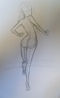
My theme is burlesque/cabaret/50's pin-ups. Basically overly sexy poses which are making my housemates question my sexuality.
i'm definitely straight, I promise. I just love drawing women because they have more a shape and i tend to find it more fun to exaggerate and change them etc.
Anyways, this is stuff i've done so far: the first picture is a human figure i drew from imagination without any sort of cartoony style. Also, my style has been heavily influenced by the work of Rion Vernon, famous 1st pin-up girl Bettie Page and Jessica Rabbit- however, all these sketches i've drawn are my own, and some have been created using a burlesque pose photo reference (i exaggerated these poses myself).


i just noticed that the girl on the right looks a bit SpumCo'esque lol


Monday, 28 February 2011
Saturday, 19 February 2011
Let's get depressed
For our sweet advert brief, Chris (my group member), came up with the idea of a charity style ad, showing homeless lame rolos that have been discarded and forgotten about... possibly crying caramel tears, and a strapline similar to "Just 40p could help save 10 rolos"...
I thought this style is quite clever, but depending on the possible mixed reaction we might get, we may have to add in a lighthearted scene at the end of the ad..
Anyway!! i've done some research on some depressing charity ads to see what they do besides showing footage of poor people to twang the heart strings:
This is a typical charity ad, with footage of the less fortunate people in 3rd world countries, with the plea of donating money to help, and gradually getting happier when you get to see what difference the money does (cue, happy kids playing with water and running into the sunset).
This other ad for Christian Aid was very clever, instead of the usual tactic, they've created almost a short story with all the narrative being very informative of the reality of what's going on. It also has the man (supposedly the dad?) looking after the baby, and as the horrible men in suits take away everything, it makes the audience go "OMG! NOOO!!"... I've never seen a charity ad like this until now (at least i dont remember), i like it's originality and doesn't give the "rolling-eyes slightly irritated" reaction that most charity ads do.
Another common tactic in charity ads is using a child's (particularly a child because you feel sorry for them more than adults) experience of poverty. The ad tells the story of the struggle this little girl has to go through to survive...
This Oxfam ad isn't anything like the normal ads, infact i included it because of the animation in it. It has a strong meaning behind it that all these disasters, poverty and other things wrong with the world feed into this giant ugly creature known as injustice, and if you speak up and make a difference, it'll make the world a better place etc... I like the strapline at the end "Be Humankind" conveying that we are all humans, and therefore being human kind, we can look after eachother etc...
SO! This bit of research has shown me different angles to take this charity ad from- typical style so it's recognisably a charity ad, a short story and experience telling. I'm not sure the last example would be as an effective one for the idea we have at the moment.
Subscribe to:
Posts (Atom)